So, your business' image is starting to look a little tired and you've decided it's time to take the plunge and embark on the long journey of a rebrand.
Rebranding is a scary step for any business, whether big or small. If done correctly, you can increase your brand's visibility and reputation massively. But, if you don't hit the nail on the head you risk ruining the hard work that you have already put in to getting your company recognised.
So first, let's start with the basics...
Why are you considering a rebrand?
When considering a rebrand, you need to take into account that your brand is more than just how your logo looks on your event stands or marketing materials. Your branding is the key to how your business is recognised and understood by prospects.
The best way for you to make the decision on whether or not you should take on a re-brand is some good old fashioned analysis: You should be asking yourself a few questions about your organisation's culture and ethos, the product you're selling and your market position before starting the cogs turning on the project:
- How is your organisation percieved within the industry, and is this how, as a business, you would like to be portrayed?
- What part of your brand or marketing techniques will you need to change to alter this perception?
- What is the market position of your organisation within your industry?
- How will this be affected if you change your brand identity?
- What are your future plans for your organisation, will you be looking to alter the way you work/how you sell your product?
When answering these questions you will no doubt come up with more research you'll need to undertake before taking the plunge. Asking yourself these questions will help you understand the possible implications of taking on a rebranding project instead of perhaps changing your marketing methods.
If by answering these questions you discover that your current logo, brand colours and tone of voice do not reflect where your brand is headed, it's time to get started on your rebrand.
So, to help spark some ideas, we take a look at some of the rebranding 'wins' and 'fails' of the past few years...
FAIL - Kraft Foods

Kraft, a huge name in the food and drink industry, decided to take the re-branding plunge back in 2009 when they revealed their new, colourful, identity.
It didn't take long for Kraft to receive a huge backlash from not only other businesses within in the industry but also the design community. Within 6 months Kraft decided to take an almost complete U-turn and revert back to their previous logo, with a few tweaks to the typeface.

Kraft were already well-known within their industry, which meant that turning the logo on its head was a big risk...that didn't pay off.
The food and drinks company were criticised for their lack of though and consideration for a brandmark that had been used and recognised across their industry virtually since the beginning.
The second logo that was released for Kraft, although very similar to the first shows that just making a few refinements to your logo may be enough to freshen up your brand and achieve the results you were initially looking for.
Kraft should have considered where they were situated in their market before making such a bold decision.
WIN - Airbnb

Before the release of their shiny new Bélo in 2014, AirBnB's brand was in desperate need of a facelift.
The company itself admitted that their dated, drab logo was only meant to be a short term fix...but 8 years later the brand's image was reborn and given a fresh lease of life - and received fantastic reviews. The Bélo is now recognised all over the world as a symbol for the company.
AirBnB didn't just create something that looked good and just update their marketing materials, they made sure that every step of the rebranding process had a story behind it.
The company took you through step by step how they came about the careful process of creating the Bélo, and the four core things that it reflects; people, places, love and the letter A.
Although not everybody took on board the story of the Bélo, with some making rude comparisons of what the logo may look like, AirBnB got a hell of a lot of press for their re-brand and as you can see, it is still referred to, two years later, as one of the most successful rebrands to date.
AirBnB also heavily promoted their re-brand through press releases and a fantastic social media strategy...all part and parcel of nailing your rebrand and reaping the benefits of increased brand awareness.
FAIL - Mastercard

MasterCard had their branding nailed, seen as one of the most iconic logos of modern age; almost everyone in the world would have recognised their simple yet effective two-circled logo.
Yet in 2006, MasterCard launched their new logo, adding a third large middle circle to the logo, which instantly attracted a lot of harsh criticism.
Of course it didn't take long for MasterCard to take a u-turn and revert back to their original logo.
This again was a typical case of if it's not broke, don't fix it.
Not only did the company completely change the logo seen and known by millions daily, they also used very poor design techniques with ill thought out gradients and an over-complicated style. There's no doubt about it, this logo just isn't as iconic as the original.
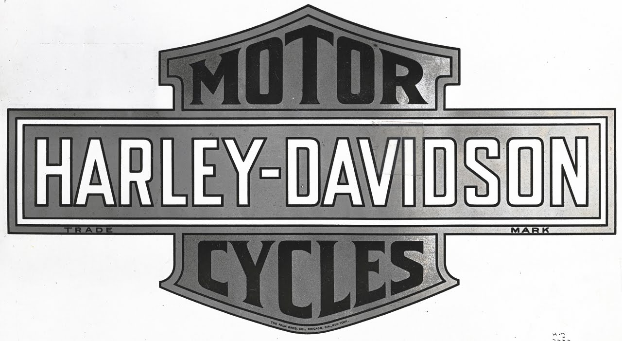
WIN - Harley Davidson

Harley Davidson, a brand that many generations love for all different reasons (be it the easy riding it offers or the more gritty aesthetic shown on our screens, such as Sons of Anarchy). Harley Davidson is a brand that nearly everyone knows, however success is not what it was back in the 1970s to 80s. The loyalty to the brand was there, but people didn't believe they could afford them and many felt the quality of the product had declined.
Harley Davidson decided to reconsider both their production and marketing approaches and made the call not to change their well-known logo. The brand became probably one of the first truly social brands (before social media).
Armed with a new deposit and pay monthly scheme, Harley Davidson showed any potential new customers that it would cost them no more than a daily coffee to ride and own the bike of their dreams. Harley Davidson also opened up its product to more than just the typical 'biker'. Creating advertisements targeting the weekend easy rider market ensured business began to boom.
All this without tweaking their logo too much from their first logo.
To conclude ...
So armed with this knowledge, it's clear that story is the biggest thing to help your rebrand. Just going ahead and changing your logo just because you don't like the colour anymore may end up tarnishing your brand's image instead of improving it.
Rebranding is not always a huge overhaul, it can be a small step or a culmanation of existing elements to give you a breath of fresh air. Most importantly, always be true to yourself and remember to be clear on your brand's goals and what you want to portray to the world.
 By
By 
